Implementation projects collect lots of indicators to monitor progress. However, the staff at the facilities reporting this data rarely analyze and use it for decision making. Generally, health service delivery data are viewed as something to be reported up to the next higher level of the health system – rather than something to be critically reviewed and used by providers at the point of care.
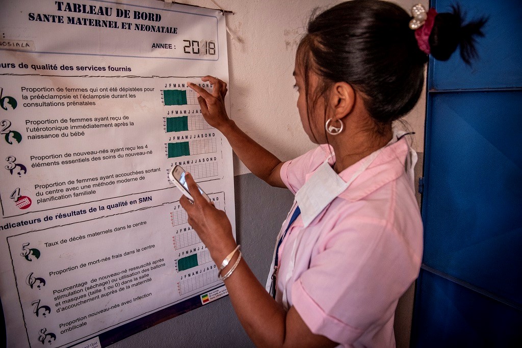
How do we encourage better use of quality data for decision making? This question is at the heart of MCSP’s efforts to improve access to and quality of reproductive, maternal, newborn and child health (RMNCH) services at community and facility levels. Throughout the life of the project, MCSP has supported ministries of health and partners to develop and use data dashboards to help providers visualize the outcomes of the services they are providing.
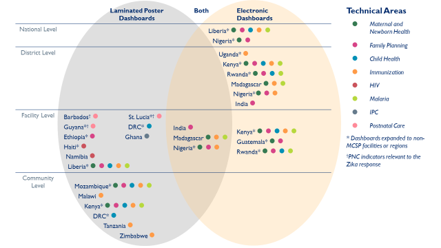
Of 32 MCSP-supported countries, 20 developed and implemented laminated poster or electronic health data dashboards as part of their monitoring & evaluation activities to promote better use of data for decision making at the point of care. The figure below shows the breadth of dashboards put in place in MCSP countries to track and support most technical areas on the RMNCH spectrum. As a testament to ministries’ approval of this approach, half have continued to support dashboards after MCSP ended.
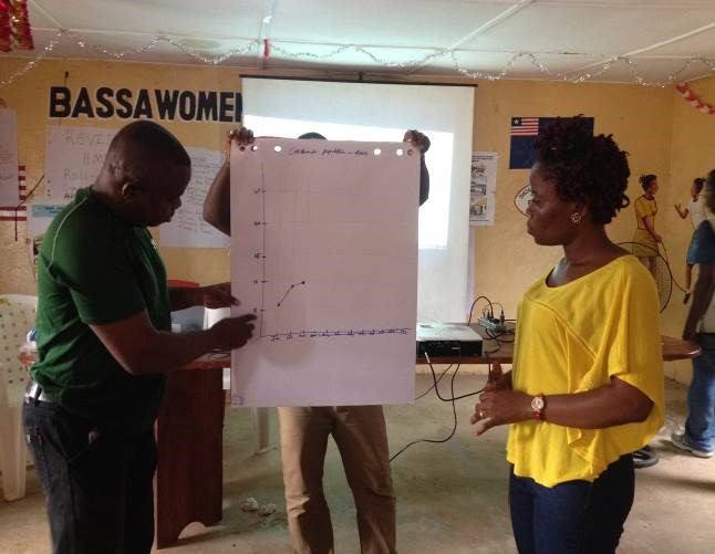
In Liberia, the Ebola outbreak dramatically decreased trust in health facilities, and the facility birth rate fell. To improve quality of care and attract communities back to facilities for health services, MCSP and the Ministry of Health used dashboards to improve service quality.
Dashboards enabled providers to identify bottlenecks and visualize data, including how the services they were providing effected the facility’s quality of care. If there were drops in service quality, facility staff would discuss the root causes of the problems. Such initiatives contributed to an impressive increase in facility birth rates, which nearly doubled from the start to the end of the project.
The dashboards also improved the timeliness and quality of national health management information systems (HMIS) data. With the dashboards, facilities generated data monthly and analyzed the information themselves. Providers then verified if the data was correct – that it was error free, and that the services really occurred – before entering it into the HMIS system.
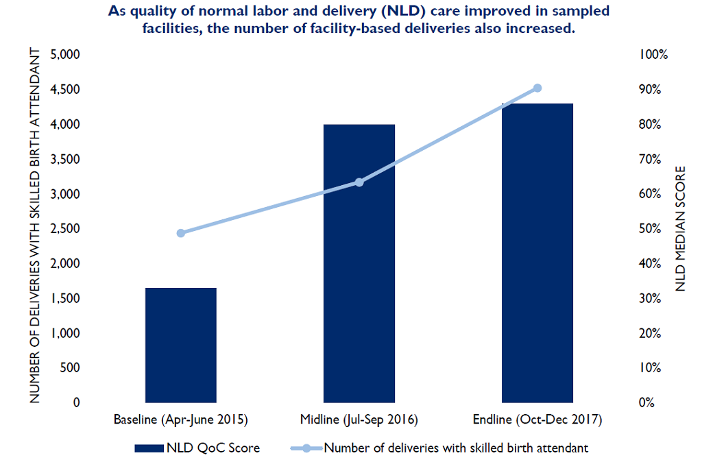
The graphic below shows the number of facility-based deliveries and service quality at the beginning and end of the Liberia Restoration of Health Services Project, as recorded by staff. Quality improvements, including use of data dashboards, led to large improvements in facility use and service quality. For example, the number of women delivering in MCSP-supported health facilities more than doubled between baseline (2,439 deliveries) and end-line (4,526 deliveries), as did the recorded Normal Labor and Delivery Quality of Care score.
Although MCSP’s Restoration Health Services project in Liberia closed, facilities continue to use the dashboards, and staff are including money for markers and poster paper in their own budgets.
Immunization projects have also long used dashboards to show progress towards universal coverage. In Malawi, MCSP reformulated their immunization dashboard to visually demonstrate how every family fully immunizing their children leads to a stronger community. This was done through use of the “My Village My Home” tool (MVMH) in two low-coverage districts – Dowa and Ntchisi. The poster, in the shape of a house, contains the name of every child in the community. When a child is immunized, a square (or “brick”) is filled in – illustrating that a strong community, like a strong house, is built one healthy member at a time.
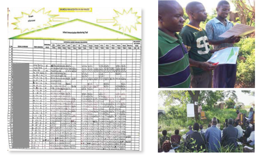
MCSP trained village heads on how to complete and analyze the posters, which were then used for discussion during community immunization meetings. By allowing everyone to interpret the data at these meetings, the entire community was motivated to reach universal coverage.
In terms of community commitment, the results speak for themselves: before introduction of the MVMH tool, full immunization in the intervention districts was below 75%; at project end, full immunization increased to above 88% in both districts. At the end-line evaluation, more than 75% of the communities still had their MVMH poster, and over 80% of those were continuing to use their poster to track immunization coverage.
Wherever MCSP has implemented dashboards, we’ve consistently found that learning to analyze and use data is a process that takes time and support. In countries where we’ve seen the most success, providers and the Ministry of Health showed desire to learn how to use data to improve service quality while we helped support the mentorship of teams.